Thursday, March 15, 2012

The Emotion of Long Exposures

     This week, since my genre project is on long exposure photography, I decided to get inspired with some nice digital prints. When I think of long exposure I often think of the fairly clichéd light drawing and perhaps even the "soft" daytime waterfall images that now pervade countless calendars. Thus, I wanted to look for something more in long exposure photography: a way that emotion can be portrayed through blurs and streaks.
     This first image stuck out to me as it seems to have an interesting compositional structure as well as a fairly clear message. The perspective of the room gives an almost distant feel to the photograph, a distance accentuated by the transitory appearance of the furniture in the room. The clearing of this once cluttered and often used room leaves the viewer feeling that something is wrong. The studious resident is now gone, taking their belongings along for the ride. 
     I particularly enjoy the second image because of the vanishing points it contains, as well as the inherent meaning(s) it portrays. First off, the rule of thirds is followed beautifully, with the man directly on the two thirds line from the left, and the train is almost directly on the one third line from the bottom. The composition of the image is beautiful, but what strikes me is the emotional content therein. What is he waiting for? Clearly he's missed multiple trains by now. And yet he waits. And waits. Perhaps a metaphor for when we're waiting for something to happen, but we're not sure what. Perhaps representative of how events in one's life can leave one faded, and distant, seemingly frozen as things move all around oneself. 
     I think this third image is actually my favorite of the bunch. I am at a loss for the meaning of the piece, yet I believe there is a message- whether intended or not. The picture depicts people moving about in their daily routines, meshing together until an almost fog like layer is created, coating the street. This mass of people seems to be a more visual interpretation of the platitudinal "sheeple" concept- everyone goes about the same trite routine. Again and again, day after day. No variation. No digression. No emotion.
     These three photographs helped me to see how I might be able to use long exposure photography in a more powerful way than simply drawing with light. I hope to make art that moves, in more than one way. 


Monday, February 27, 2012

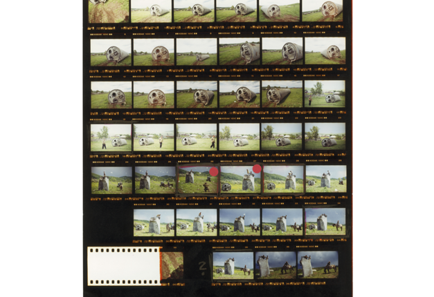
Magnum Contact Sheet Series

     I've always felt that, by now, most unique artistic ideas have been taken. Thus, whenever I come across a fresh and new idea or style I am always in awe. In this series, magnum photographers have taken their in progress contact sheets and turned them into unique art. 
 The above print shows the artists many attempts to get an effective portrait, in addition to displaying the way that he goes about choosing a suitable print. The bold red outlines greatly contrast with the grayscale, making it both informative and aesthetically successful. 
 This image is much the same, but with a greater variety of color, giving an even more vivid feel.
 In this image, the photographer appears to have been telling a story through the ominous imagery and slightly varying perspectives. Again, the chosen pictures have been marked in brilliant red.
This image, my favorite, does attempt to tell a story. It is complete with a sort of "storyboard" that explains the different actions taking place. The image gives a feeling of being behind the scenes of the photographic processes of the artist, since the notes appear to be notes to the artist himself.


This unique series turns a process into art, and that is what art is all about in my opinion: innovation and creativity. 

Thursday, February 2, 2012

Photoshop Art

     This week the tutorial I chose was one in which artistic overlaying  and a couple other techniques in order to create a new, pretty cool image. The tutorial was immensely helpful for me because it showed me the many things you can do in photoshop with simply masking and layering.
     First of all, I chose the images I wanted to overlay together. I chose a really dark sky, a nebula, a raven, and eventually a moon because my attempt at making one failed.
     I cut out the nebula and put it over the sky and soon resized it and made it much less opaque. (seen below)

Then, I drew a circle and began playing with the many mask functions that are in photoshop including beveling, color overlay, and outer glow.

 
      After creating a really crappy moon, I cut out the raven and overlaid it on the image.
      And then I used a sort of satiny filter to make it a bit darker without losing subtle features.
     Finally, I cropped the image and rearranged the components a bit. Oh and I replaced the moon.
     It didn't turn out looking so great, but I got the gist of the mechanics involved in making it so it was overall a helpful (yet lengthy) experience!

Monday, January 23, 2012

Two New Tools

     There are a multitude of photoshop tutorials on the internet showing various techniques, but most of them are very specific- too specific. One tutorial I found breaks from that pattern and proves to be especially useful in multiple ways.
     This tutorial in particular described how one might make a picture appear to be a film photograph while also showing one of the most fundamental aspects of photoshop: the filter.
     The picture I started with was a color photograph- but I soon made it into a film grained image with selective color.
     Immediately, I set the saturation to zero to make it black and white, and then began following the tutorial. It first explained how to use a filter in combination with a layer- in a method it called "non-destructive editing". Soon I had created a film style image, but I wanted to try one more thing.
      I wanted to give a close-up to exhibit the grain, it's really remarkable how much it looks like film.

     Finally I decided to do something on my own- selectively color a piece of the image. I used the magnetic lasso to select a piece of my filter layer and then deleted it, leaving that piece of the background unfiltered. This created a sort of selective color effect.


Wednesday, January 11, 2012

What Time Is It?!

     Saturday morning cartoons were a large part of my life when I was young- they were something I looked forward to fervently each week. I've since grown, however, one cartoon in particular remains in my life: Adventure Time.

     Adventure Time is a cartoon hosted by Cartoon Network about a boy (Finn) and his dog (Jake), and their adventures in the Land of Ooo. It that has an aesthetic all its own with unusual characters and protean environments. 


 The characters are interestingly designed, but where the art design really shines is with its backdrops. Each set is intricately laced with subtle details, for example Finn and Jake's home is a hollowed out tree with a multitude of details.


     Perhaps the reason I so enjoy the show is that it has an undeniable sense of humor regarding itself, the art is extremely varied and interesting, and the undertones are surprisingly adult- most children would miss this of course. (For example, the land of Ooo is actually a post-war zone. The war is referred to as the Great Mushroom War, which perhaps refers to the dropping of atomic bombs across the land.) Overall the show is just amazing, and should be given a watch by all people of all ages.

Monday, December 19, 2011

The Original Master of Contrast

     Whether one knows his name or not, it is likely that one has been exposed to one of Caravaggio's paintings at some point or another. Caravaggio painted many years ago, but his works of art are still among the most prominent of today. So what makes his pieces so incredibly noteworthy? Perhaps for his content choices, or perhaps due to his mastery of the usage of light and dark.'
     Caravaggio often painted scenes from ancient Greek mythology, such as the slaying of Medusa. The most striking content choice of his must be the constant decapitations occurring within his paintings. His choice to include such a gruesome scene is extremely polarizing, yet it achieves a level of emotional power that all artists strive to gain.

     Caravaggio is not only well known for his content however, he is also often noted for his clear mastery of the elements of light and dark. He used light in multiple ways: he focused the viewer's attention towards what he intended as the focal point, and also uses light as a symbol. For example, in his painting depicting the taking of christ, all of christ's captors are shadowed and in the dark, representing the darkness and evil behind their intentions.
     Caravaggio gives wonderful examples of how to best use contrast, and photographers can certainly stand to learn something from him. Photography is entirely about the difference between light and dark; without the inherent difference between the two, photography would not exist at all. Thus, for a photographer to thrive, he must acknowledge the immense importance of contrast.

Monday, December 5, 2011

An Open Ended Inspiration: Alternative Techniques

     Ever since I first saw photographs that utilize unique and creative techniques, I longed to try and attempt them myself. Thus, alternative technique has been a huge inspiration in my photography for as long as I can remember. When I speak of these creative stratagems, I am speaking mainly of things such as stop motion, long exposure, and double exposure photography.
     Stop motion photography often entails an event that we do not perceive due to the extreme swfitness with which it occurs, and thus this style of photography was popularized. Stop motion captures everything from a balloon popping to water splashing (which seems to have become quite popular recently). Yet, this type of photography is arguably, the hardest type of photography to do. This is due to the fact that alongside all normal photography rules, there are an entirely new set of rules to follow. For example, a stop motion photographer may have to worry about both exposure time, AND figuring out when to trigger the shutter at the same time.
     
     The appeal of stop motion, in my opinion of course, is that it allows us to see a world unseen. Above, you can see the beauty of water in motion, and perhaps decipher the mystical language it speaks.


     Long exposure photography has become especially popular among aspiring photographers due to the blatantly ethereal effects that may be achieved through its use. This style can be used literally in every picture in one way or another, from fireworks to stars; it all looks nicer with a longer exposure.
    

     Lastly there is double exposure photography, perhaps the most potentially evocative type of photography. With this technique, an artist may make a smooth transition or even juxtapose two disparate things. Perhaps a silhouette of a broken man, covered with an exposure of ashes; maybe an aspiring girl with thoughts of becoming an architect, achieved by comparing the two in a single photograph.
     Artists everywhere ought to at least experiment with this technique due to the amazing effects that can be accomplished with a bit of work. Granted, this is EXTREMELY tough to pull off in film photography due to a need for meticulous planning and many tries. However, the product is well worth the effort.
     The only techniques I've dabbled in thus far are the two exposure techniques, and I have to say, they are frustrating to print, but they turn out so nicely. Now that I have double and long exposures under my belt perhaps I can begin work on stop motion photography.