Saturday, October 29, 2011

The Art of Video Games Part 2

      With my previous post I talked about the inspiring aspects of Bioshock and LIMBO and I was going on and on, so I thought I ought to split this topic into two posts to make it manageable (and readable). So, as I was saying: video games are the newest way to make art and express sentiments.
     The first of the two games I want to show you in this part is called Mirror's Edge. Here's the gamefaqs description:

"In a city where information is heavily monitored, agile couriers called runners transport sensitive data away from prying eyes. In this seemingly utopian paradise, a crime has been committed, your sister has been framed and now you are being hunted."

     Mirror's Edge continues the dystopian concept, but in a very different way. Instead of a city meant to further the arts as there was in Bioshock, the city in Mirror's Edge simply wishes to restrict the flow of information (more along the lines of the Orwellian dystopia).
     Mirror's Edge follows one of the aforementioned couriers as they run across rooftops to transport information across the city. While running across these rooftops you can see the stark white city with it's selective color patches throughout. It's an aesthetic that's hard to explain but understandable once seen. Mirror's Edge is beautiful, and looks simple in its own right. This minimalism brings about yet another inspiring art style since it really shows that when something is muted, even something such as color, it can create a wonderful and unique style.

     
     The final game I wanted to show is the extremely recent game, Deus Ex: Human Revolution. As always, here is the gamefaqs description:

"At a time when scientific advancements are routinely turning athletes, soldiers and spies into super-enhanced beings, someone is working very hard to ensure mankind's evolution follows a particular path. You need to discover why - because the decisions you take and the choices you make will be the only things that can determine mankind's future."

     Deus Ex takes place in a world where the popular concept of transhumanism (human enhancement through robotics) takes precedence. In this world there are not only human enhancements, but also enhancements on architecture and art. The artists working on Deus Ex had to anticipate the way in which architecture would evolve if Earth were to enter into a similar situation as the world in Deus Ex, and thus the environments in the game were born. This game brings into play the concept of artistic anticipation, which occurs often when making science fiction art. Sci fi art is some of my favorite to view, thus this concept proved very interesting to me. The game's environs were extremely inspiring to me, especially after thinking about how much time and planning goes into anticipating something as complex and ornate as an entire sci fi city. With this, Deus Ex proves another excellent example of art.


The Art of Video Games Part 1

     Only recently have video games begun to be considered as an art medium, and even so, there remains no paucity of controversy. Video games have been through a roller coaster of acclaim and vituperation; however, for the first time ever, they are being acknowledged by the Smithsonian Institute as a form of art. This has further inspired me to see art within the games that I play, and I wish to share a few of the most artistically valuable games I have experienced.
     The first game I'd like to mention is one in which the vivid atmosphere is only rivaled by the story: Bioshock. Here is a good description from www.gamefaqs.com, 


"After your plane crashes into icy uncharted waters, you discover a rusted bathysphere and descend into Rapture, a city hidden beneath the sea. Constructed as an idealistic society for a hand picked group of scientists, artists and industrialists, the idealism is no more. Now the city is littered with corpses, wildly powerful guardians roam the corridors as little girls loot the dead, and genetically mutated citizens ambush you at every turn...Make meaningful choices and mature decisions, ultimately culminating in the grand question: do you exploit the innocent survivors of Rapture...or save them?"

     Bioshock first introduced me to the dystopian topic, popularized by the likes of Ayn Rand, George Orwell, and Aldous Huxley, which then inspired me to both look into dystopian literature; but Bioshock did not only introduce me to Huxley and Orwell, it also first showed me Art Deco design. Art Deco was first popularized in the 20's, but remains a commonly used architectural design choice as well as interior design choice. Art Deco is one of my favorite style of architecture, but also of art in general. Thus Bioshock introduced me to two of my favorite art styles, one of literature and one of visual arts.


     While the first game was created by a major game publisher, the second game I want to share is a small indie game called LIMBO. Again, here's a quick overview from gamefaqs:

"[LIMBO] puts players in the role of a young boy traveling through an eerie and treacherous world in an attempt to discover the fate of his sister."

     The concept is extremely simple, but there is a strong emphasis on treacherous in that description. The alluring part of LIMBO, however, is the art style that went into making it. The game is in all black and white with a sort of misty, enigmatic air to it. This art style greatly contributes to the feeling of the game, which is easily one of some degree of fear, and indefinitely one of dread.
    Another interesting aspect of LIMBO is trying to figure out the story. There is no voice acting, no words, no nothing, except for the boy and his journey through this land. Some believe it's representative of the afterlife, or perhaps even life itself, while others believe it to be a metaphor that spans the width of everything we know. This is interesting to note as this is characteristic of fine art: it sets you on a track with what it presents and then you must interpret it for not what it is, but for what it represents and ultimately what it means
      This game is yet another case promoting the view of video games as art.


Friday, October 28, 2011

Thomas Hudson Reeve: Experimental-Experimental Photography

     Pinhole camera photography is often considered a sort of unusual or experimental type of photography now that film and digital are so prevalent, but Thomas Hudson Reeve takes this experiment a step further. 
     Reeve is an experimental pinhole photographer, meaning, he essentially experiments with an experiment. In order to get the pictures he does, Reeve folds photographic paper into intricate, or even simple shapes and then places it into the pinhole camera to see what happens. The result is an extremely interesting effect where there are clear lines at the bent parts, but each divided section also has its own sort of style or flair to it. Though it is all the same "picture" it features different perspectives and different lighting and different shadows in each part.
    
     His pictures are not available for download; however, they may be seen in an online gallery here:           http://www.papercams.com/gallery/photos.html


     My particular favorites are the pictures he calls "Big Rock 1" and "Riverside Park". Each picture has its own unique fold and the lighting in each division proves to be quite protean as it never remains the same in any one picture. Reeve has inspired me to look into experimental ways to go about using my pinhole camera, perhaps not through folding, but maybe some other technique, perhaps putting another transparent object within the box to add shapes and/or dimensions. Regardless, I'm glad I stumbled upon Reeve as, now, I feel ready to take on the onus of pinhole camera work.


     Big Rock 1: http://www.papercams.com/gallery/photo8.html


     Riverside Park: http://www.papercams.com/gallery/photo6.html

Twelve Queries for The Aspiring Imagemaker

     The title refers to an article I recently read in which Robert Hirsch explains and answers some common questions that up and coming photographers may have. He goes into abstractions regarding each question and gets a bit redundant; however, he makes some great points about certain topics in photography. There were three "queries" in particular that spoke to me: "Why is it important to be proficient in your medium?", "Why is it important to make your own images?", and "Is it necessary to explain my images?".
     The topic of being proficient in the medium one is working in is inevitable, as one must try again and again in order to suceed in it. Hirsch brings up the point that a photographer's initial print is like a first draft, essentially a rough scribble of ideas. Upon developing and refining this cloud of ideas, the photographer will end up with a well thought out piece of art. This idea especially spoke to me because of how many prints I need to make in order to get just the right one. I start out cropping it one way and later decide it would look nicer another way; I start out at a 5.6 f stop and move to an 11 f stop for a different contrast; and not to mention filters (which I switch at least 3 times per print).
This print took me about 7 or 8 tries to get just right.

     While being proficient is important, the concept of making your own images is significant in that it allows one to see the world differently. Making one's own prints, Hirsch argues, changes the way one sees the world in sense of appreciation and discovery. This idea was very interesting to me as I have always had a relatively keen eye for detail, and it has only grown since I began to envelop myself in my photography. I have since begun to see nature even more appreciatively and with a reverent eye. There is a down side to this as, occasionally, there will be a time in which I have to sacrifce being able to capture a moment for simply experiencing it. And experience in itself is wholly important.
To get this picture I awkwardly placed my camera at the edge of a mosaic bowl, essentially warping the way reality appears.

     The final idea, whether it is necessary to explain your images, is especially striking to me. I have always pondered this question. Do my images need to speak for themselves? Is photography actually about creating imagery that speaks for itself, or about creating imagery that's fully interperative and subjective? Hirsch argues that viewers need some sort of toe-hold when viewing work, but the photo should then speak for itself from then on. I think this is a wonderful way to look at things since it allows the artist to set the viewer in the direction they intended, but then allow interperatation to take over. Perhaps a title will tell enough.
     Majesty

Sunday, October 23, 2011

Imogen Cunningham: More Than Portraits

     I recently read an article about the great portrait photographer, Imogen Cunningham. Inititally, I became a bit uninterested upon reading that she specialized in portraits, my least favorite type of photography; however, upon actually seeing her work, my entire outlook on portrait photography changed. I used to think of portrait photography as this dull, boring type of capturing a moment until I saw Cunningham's portraits which are, simply put, more than just portraits. They are, in essence, expressions of the subjects personality and occupation.
     Cunningham used scenery, lighting, and developing effects in order to somehow reflect her subjects inner psyche, or perhaps something even simpler: his or her occupation. Yet, words alone cannot give credence to the genius of Cunningham, one must see the "portraits" in order to understand the interesting and unique way that she portrays her subjects. For example, her portrait of Man Ray, A Man Ray Version of Man Ray, utilizes a surreal developing technique in order to portray Man Ray's metaphorical and fantastical photography.

A Man Ray Version of Man Ray- 1960

     Yet, not only did Imogen create phenomenal, representative portraits of people, but also she created beautiful "portraits" of objects, essentially redefining what a portrait is. Imogen's portrait of a magnolia blossom is especially beautiful, but it is not simply beautiful. It is expressive somehow, perhaps due to the intricate contours contained within the central bud, or perhaps due to the silky appearance of the petals. It certainly sets a mood, which is more than I had previously thought possible of a portrait, let alone a portrait of a flower.

Magnolia Blossom- 1925

     I'm glad that I stumbled upon Cunningham's photography. Now I don't think I'll feel hesitant to take portrait photography any longer.

Saturday, October 8, 2011

The Art of Album Covers

     Since the invention of the compact disc there has been an increasingly large amount of beautiful, creative, and evocative album artwork. The way I see it, the artwork has a distinct job to do: pique the interest of the browsing music enthusiast, and match the music so that, once bought, the listener can relate to the artwork. Ever since I turned 12 my music collection has grown exponentially, and therefore with many more album covers to appreciate and view. I'd like to present and discuss 3 of the 715 albums that I've accumulated over the years, how they're relevant, and how they've affected me.


Homesick by A Day to Remember

     Homesick is the first A Day to Remember album I had ever heard, and I have to say it proved to be a great introduction to their amalgam of pop, rock, and post-hxc. The reason I initially picked up the album was due to the intriguing cover design, thus making it extremely relevant to me. The cover takes the term "the light at the end of the tunnel" quite literally and makes it into a life or death situation, or perhaps just an extreme metaphor for life itself. We have to ride life out despite what may be in store for us in our truculent, dark tunnels, but at least we always know that there remains a light at the end. 
      Yet, not only can one relate to the ultimate message of the cover, one might also notice upon listening to the tracks on the album that the musical structure actually takes a similar path as the album cover. Many of the tracks start out with light, pop-punk vocals, and quickly move into more brutal ones that greatly contrast one another. 

In case anyone's feeling brave, here's one of the tracks from Homesick: http://www.youtube.com/watch?v=FsptGR1g0c0&feature=related

In Rainbows by Radiohead

     Unfortunately, I did not find out about the genius of Radiohead until early last year, but once I did I became enamored. Radiohead's album In Rainbows mixes mellow tracks with great ethereal and airy tracks that, strangely, mesh together perfectly. Before I say anything further, start listening to this song, it's really good. I promise (and no screaming this time). http://www.youtube.com/watch?v=TNRCvG9YtYI

     Okay, now that you've listened to it/are listening to it, you'll notice how light every single layer of the song is, drums and all. I feel like this song greatly encompasses the feel of the entire album Radiohead has created, and goes well with the artwork. And as for the artwork itself, this was my first Radiohead album as well since I was intrigued by this cover. ThIn addition, the explosions of paint give the cover a sort of vibrant feel with all of the warm colors and cool colors overlapping, but still enmeshing, just like the tracks on the album.

On Letting Go by Circa Survive

     Last, but most definitely not least, is an album from one of my favorite bands, Circa Survive. I feel that their music is pretty much the epitome of all things ethereal, and their album covers are no different. 
     Again, try and get this song started and then head back to read this: http://www.youtube.com/watch?v=MAp3uAk-poo&feature=related
     On Letting Go is an album about coping with loss, whether it be the loss of a parent, the loss of a friend, or the loss of a lover. The slow progression in the song you're (hopefully) listening to right now is intended to mimic or encompass the flow of emotions immediately following a great loss. That's one of the many reasons I love CS so much, their music is more than music, it's more than thought, it's art.
     The album artwork depicts someone who is so despondent after a loss they've separated themselves from everyone around them, and even the ground or earthliness. In addition, we can see a storm coming up over the horizon, ready to ground this despondent individual. 
    In my opinion of course, the album artwork is beautiful, and fits the music perfectly.


I hope you enjoyed at least one of those album covers, even if you didn't like the music, and thanks to those of you who read and listened to this!


Friday, October 7, 2011

The Art of Miyazaki

     It was once controversial to consider movies to be art, yet, this time has passed and movies are now largely considered art. However, my first personal enocunter with a movie that I considered to be a work of art was when I was 14 and watched the film, Spirited Away; effectively introducing me to, and enamoring me of, Studio Ghibli. Studio Ghibli is a Japan based animation company with the genius Hayao Miyazaki at the helm, and since 1985 they have created 18 feature films using all hand drawn animation techniques.

Spirited Away (2001)
     
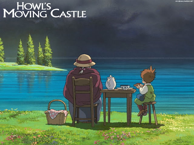
     Each movie has a unique art style and sensibility, yet all hover around the theme of nature, its beauty, and its due reverence. This theme is gone about by portraying nature in as detailed a way as possible, by inhabiting each and every forest with chimerical creatures, thriving plant life, and effectively giving the environments life. This beauty is established through detailed painting and drawing techniques, that when put in motion are truly unbelieveable. Most everyone who has seen Spirited Away or Castle in the Sky can probably relate to the feeling I am talking about, as it's really quite impossible to miss out on since the art is so evocative that it reaches a level of universal appeal.

Howl's Moving Castle (2004)

     In addition to evoking reverence for nature and its beauty, the beautiful movies from Studio Ghibli explore other milieu as well, such as wartorn countries, mossy forts, and rustic villages. Each and every scene is carefully painted or drawn in such a way as to evoke some sort of emotion in the person vieiwng it. Perhaps a feeling of rustic nostalgia, a glimmer of hope, or even a sense of dread and terror.

Castle In The Sky (1986)
     Whether it be Spirited Away, or Nausicaa, each Ghibli movie manages to utilize artwork in such a way that it effectively brings about emotions and clearly states themes for the viewer to take in, and this is exactly what I feel that art ought to do.

 Nausicaa of the Valley in the Wind (1984)

     
     Overall, these movies are important to me because I feel they've inspired me to revere and appreciate the natural world, as well as inspired me to make art. The way that these movies utilize artwork to evoke emotion is quite the phenomenon in itself; however, when paired with the themes presented, the movies quickly enter the realm of the vividly artistic.

Princess Mononoke (1997)