Thursday, March 15, 2012

The Emotion of Long Exposures

     This week, since my genre project is on long exposure photography, I decided to get inspired with some nice digital prints. When I think of long exposure I often think of the fairly clichéd light drawing and perhaps even the "soft" daytime waterfall images that now pervade countless calendars. Thus, I wanted to look for something more in long exposure photography: a way that emotion can be portrayed through blurs and streaks.
     This first image stuck out to me as it seems to have an interesting compositional structure as well as a fairly clear message. The perspective of the room gives an almost distant feel to the photograph, a distance accentuated by the transitory appearance of the furniture in the room. The clearing of this once cluttered and often used room leaves the viewer feeling that something is wrong. The studious resident is now gone, taking their belongings along for the ride. 
     I particularly enjoy the second image because of the vanishing points it contains, as well as the inherent meaning(s) it portrays. First off, the rule of thirds is followed beautifully, with the man directly on the two thirds line from the left, and the train is almost directly on the one third line from the bottom. The composition of the image is beautiful, but what strikes me is the emotional content therein. What is he waiting for? Clearly he's missed multiple trains by now. And yet he waits. And waits. Perhaps a metaphor for when we're waiting for something to happen, but we're not sure what. Perhaps representative of how events in one's life can leave one faded, and distant, seemingly frozen as things move all around oneself. 
     I think this third image is actually my favorite of the bunch. I am at a loss for the meaning of the piece, yet I believe there is a message- whether intended or not. The picture depicts people moving about in their daily routines, meshing together until an almost fog like layer is created, coating the street. This mass of people seems to be a more visual interpretation of the platitudinal "sheeple" concept- everyone goes about the same trite routine. Again and again, day after day. No variation. No digression. No emotion.
     These three photographs helped me to see how I might be able to use long exposure photography in a more powerful way than simply drawing with light. I hope to make art that moves, in more than one way. 


Monday, February 27, 2012

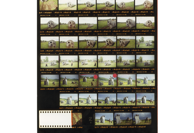
Magnum Contact Sheet Series

     I've always felt that, by now, most unique artistic ideas have been taken. Thus, whenever I come across a fresh and new idea or style I am always in awe. In this series, magnum photographers have taken their in progress contact sheets and turned them into unique art. 
 The above print shows the artists many attempts to get an effective portrait, in addition to displaying the way that he goes about choosing a suitable print. The bold red outlines greatly contrast with the grayscale, making it both informative and aesthetically successful. 
 This image is much the same, but with a greater variety of color, giving an even more vivid feel.
 In this image, the photographer appears to have been telling a story through the ominous imagery and slightly varying perspectives. Again, the chosen pictures have been marked in brilliant red.
This image, my favorite, does attempt to tell a story. It is complete with a sort of "storyboard" that explains the different actions taking place. The image gives a feeling of being behind the scenes of the photographic processes of the artist, since the notes appear to be notes to the artist himself.


This unique series turns a process into art, and that is what art is all about in my opinion: innovation and creativity. 

Thursday, February 2, 2012

Photoshop Art

     This week the tutorial I chose was one in which artistic overlaying  and a couple other techniques in order to create a new, pretty cool image. The tutorial was immensely helpful for me because it showed me the many things you can do in photoshop with simply masking and layering.
     First of all, I chose the images I wanted to overlay together. I chose a really dark sky, a nebula, a raven, and eventually a moon because my attempt at making one failed.
     I cut out the nebula and put it over the sky and soon resized it and made it much less opaque. (seen below)

Then, I drew a circle and began playing with the many mask functions that are in photoshop including beveling, color overlay, and outer glow.

 
      After creating a really crappy moon, I cut out the raven and overlaid it on the image.
      And then I used a sort of satiny filter to make it a bit darker without losing subtle features.
     Finally, I cropped the image and rearranged the components a bit. Oh and I replaced the moon.
     It didn't turn out looking so great, but I got the gist of the mechanics involved in making it so it was overall a helpful (yet lengthy) experience!

Monday, January 23, 2012

Two New Tools

     There are a multitude of photoshop tutorials on the internet showing various techniques, but most of them are very specific- too specific. One tutorial I found breaks from that pattern and proves to be especially useful in multiple ways.
     This tutorial in particular described how one might make a picture appear to be a film photograph while also showing one of the most fundamental aspects of photoshop: the filter.
     The picture I started with was a color photograph- but I soon made it into a film grained image with selective color.
     Immediately, I set the saturation to zero to make it black and white, and then began following the tutorial. It first explained how to use a filter in combination with a layer- in a method it called "non-destructive editing". Soon I had created a film style image, but I wanted to try one more thing.
      I wanted to give a close-up to exhibit the grain, it's really remarkable how much it looks like film.

     Finally I decided to do something on my own- selectively color a piece of the image. I used the magnetic lasso to select a piece of my filter layer and then deleted it, leaving that piece of the background unfiltered. This created a sort of selective color effect.


Wednesday, January 11, 2012

What Time Is It?!

     Saturday morning cartoons were a large part of my life when I was young- they were something I looked forward to fervently each week. I've since grown, however, one cartoon in particular remains in my life: Adventure Time.

     Adventure Time is a cartoon hosted by Cartoon Network about a boy (Finn) and his dog (Jake), and their adventures in the Land of Ooo. It that has an aesthetic all its own with unusual characters and protean environments. 


 The characters are interestingly designed, but where the art design really shines is with its backdrops. Each set is intricately laced with subtle details, for example Finn and Jake's home is a hollowed out tree with a multitude of details.


     Perhaps the reason I so enjoy the show is that it has an undeniable sense of humor regarding itself, the art is extremely varied and interesting, and the undertones are surprisingly adult- most children would miss this of course. (For example, the land of Ooo is actually a post-war zone. The war is referred to as the Great Mushroom War, which perhaps refers to the dropping of atomic bombs across the land.) Overall the show is just amazing, and should be given a watch by all people of all ages.

Monday, December 19, 2011

The Original Master of Contrast

     Whether one knows his name or not, it is likely that one has been exposed to one of Caravaggio's paintings at some point or another. Caravaggio painted many years ago, but his works of art are still among the most prominent of today. So what makes his pieces so incredibly noteworthy? Perhaps for his content choices, or perhaps due to his mastery of the usage of light and dark.'
     Caravaggio often painted scenes from ancient Greek mythology, such as the slaying of Medusa. The most striking content choice of his must be the constant decapitations occurring within his paintings. His choice to include such a gruesome scene is extremely polarizing, yet it achieves a level of emotional power that all artists strive to gain.

     Caravaggio is not only well known for his content however, he is also often noted for his clear mastery of the elements of light and dark. He used light in multiple ways: he focused the viewer's attention towards what he intended as the focal point, and also uses light as a symbol. For example, in his painting depicting the taking of christ, all of christ's captors are shadowed and in the dark, representing the darkness and evil behind their intentions.
     Caravaggio gives wonderful examples of how to best use contrast, and photographers can certainly stand to learn something from him. Photography is entirely about the difference between light and dark; without the inherent difference between the two, photography would not exist at all. Thus, for a photographer to thrive, he must acknowledge the immense importance of contrast.

Monday, December 5, 2011

An Open Ended Inspiration: Alternative Techniques

     Ever since I first saw photographs that utilize unique and creative techniques, I longed to try and attempt them myself. Thus, alternative technique has been a huge inspiration in my photography for as long as I can remember. When I speak of these creative stratagems, I am speaking mainly of things such as stop motion, long exposure, and double exposure photography.
     Stop motion photography often entails an event that we do not perceive due to the extreme swfitness with which it occurs, and thus this style of photography was popularized. Stop motion captures everything from a balloon popping to water splashing (which seems to have become quite popular recently). Yet, this type of photography is arguably, the hardest type of photography to do. This is due to the fact that alongside all normal photography rules, there are an entirely new set of rules to follow. For example, a stop motion photographer may have to worry about both exposure time, AND figuring out when to trigger the shutter at the same time.
     
     The appeal of stop motion, in my opinion of course, is that it allows us to see a world unseen. Above, you can see the beauty of water in motion, and perhaps decipher the mystical language it speaks.


     Long exposure photography has become especially popular among aspiring photographers due to the blatantly ethereal effects that may be achieved through its use. This style can be used literally in every picture in one way or another, from fireworks to stars; it all looks nicer with a longer exposure.
    

     Lastly there is double exposure photography, perhaps the most potentially evocative type of photography. With this technique, an artist may make a smooth transition or even juxtapose two disparate things. Perhaps a silhouette of a broken man, covered with an exposure of ashes; maybe an aspiring girl with thoughts of becoming an architect, achieved by comparing the two in a single photograph.
     Artists everywhere ought to at least experiment with this technique due to the amazing effects that can be accomplished with a bit of work. Granted, this is EXTREMELY tough to pull off in film photography due to a need for meticulous planning and many tries. However, the product is well worth the effort.
     The only techniques I've dabbled in thus far are the two exposure techniques, and I have to say, they are frustrating to print, but they turn out so nicely. Now that I have double and long exposures under my belt perhaps I can begin work on stop motion photography.

Thursday, November 10, 2011

The Art of Desolation: The Holga

     Upon searching for Holga photography to inspire me, I noticed a pattern within many of the photos. In nearly every other Holga photograph I found, there was an air of loneliness, isolation, and desolation. Yet, it was a beautiful loneliness. This beautiful desolation seems to be the trademark shot of the Holga, but what more can we do with our Holgas? What other emotions can we evoke with that muggy vignette?
     I believe we can create and emit a broad range of emotion through our photography, so why not through our Holga photography? I wondered why this dim and hauntingly beautiful style became so popular among Holga artists, and realized it was definitely the vignette effect. Without the vignette in the above picture, it would be a simple, still a bit ominous, but simple picture of a road. It's an empty road, but with the vignette it feels tightened, restricted, claustrophobic. Without it, it might feel unrestrained: free. Perhaps this vignette is used in this way because it is so easy to fall into the trap of evoking a constricting feeling, leading to an overall tone of isolation.
     Seeing all of this desolate photography made me want to break the pattern and try and use the vignette in more innovative ways, not just as a moody platitude. When shooting my role I tried using as much light as possible to avoid the dank feeling seen in so many Holga photos. In addition, I took pictures of nature. I hoped that the combination of lighting and nature might brighten a field of photgrahy that seems to be bogged down in the dark, embracing grasp of the hackneyed.

Saturday, October 29, 2011

The Art of Video Games Part 2

      With my previous post I talked about the inspiring aspects of Bioshock and LIMBO and I was going on and on, so I thought I ought to split this topic into two posts to make it manageable (and readable). So, as I was saying: video games are the newest way to make art and express sentiments.
     The first of the two games I want to show you in this part is called Mirror's Edge. Here's the gamefaqs description:

"In a city where information is heavily monitored, agile couriers called runners transport sensitive data away from prying eyes. In this seemingly utopian paradise, a crime has been committed, your sister has been framed and now you are being hunted."

     Mirror's Edge continues the dystopian concept, but in a very different way. Instead of a city meant to further the arts as there was in Bioshock, the city in Mirror's Edge simply wishes to restrict the flow of information (more along the lines of the Orwellian dystopia).
     Mirror's Edge follows one of the aforementioned couriers as they run across rooftops to transport information across the city. While running across these rooftops you can see the stark white city with it's selective color patches throughout. It's an aesthetic that's hard to explain but understandable once seen. Mirror's Edge is beautiful, and looks simple in its own right. This minimalism brings about yet another inspiring art style since it really shows that when something is muted, even something such as color, it can create a wonderful and unique style.

     
     The final game I wanted to show is the extremely recent game, Deus Ex: Human Revolution. As always, here is the gamefaqs description:

"At a time when scientific advancements are routinely turning athletes, soldiers and spies into super-enhanced beings, someone is working very hard to ensure mankind's evolution follows a particular path. You need to discover why - because the decisions you take and the choices you make will be the only things that can determine mankind's future."

     Deus Ex takes place in a world where the popular concept of transhumanism (human enhancement through robotics) takes precedence. In this world there are not only human enhancements, but also enhancements on architecture and art. The artists working on Deus Ex had to anticipate the way in which architecture would evolve if Earth were to enter into a similar situation as the world in Deus Ex, and thus the environments in the game were born. This game brings into play the concept of artistic anticipation, which occurs often when making science fiction art. Sci fi art is some of my favorite to view, thus this concept proved very interesting to me. The game's environs were extremely inspiring to me, especially after thinking about how much time and planning goes into anticipating something as complex and ornate as an entire sci fi city. With this, Deus Ex proves another excellent example of art.


The Art of Video Games Part 1

     Only recently have video games begun to be considered as an art medium, and even so, there remains no paucity of controversy. Video games have been through a roller coaster of acclaim and vituperation; however, for the first time ever, they are being acknowledged by the Smithsonian Institute as a form of art. This has further inspired me to see art within the games that I play, and I wish to share a few of the most artistically valuable games I have experienced.
     The first game I'd like to mention is one in which the vivid atmosphere is only rivaled by the story: Bioshock. Here is a good description from www.gamefaqs.com, 


"After your plane crashes into icy uncharted waters, you discover a rusted bathysphere and descend into Rapture, a city hidden beneath the sea. Constructed as an idealistic society for a hand picked group of scientists, artists and industrialists, the idealism is no more. Now the city is littered with corpses, wildly powerful guardians roam the corridors as little girls loot the dead, and genetically mutated citizens ambush you at every turn...Make meaningful choices and mature decisions, ultimately culminating in the grand question: do you exploit the innocent survivors of Rapture...or save them?"

     Bioshock first introduced me to the dystopian topic, popularized by the likes of Ayn Rand, George Orwell, and Aldous Huxley, which then inspired me to both look into dystopian literature; but Bioshock did not only introduce me to Huxley and Orwell, it also first showed me Art Deco design. Art Deco was first popularized in the 20's, but remains a commonly used architectural design choice as well as interior design choice. Art Deco is one of my favorite style of architecture, but also of art in general. Thus Bioshock introduced me to two of my favorite art styles, one of literature and one of visual arts.


     While the first game was created by a major game publisher, the second game I want to share is a small indie game called LIMBO. Again, here's a quick overview from gamefaqs:

"[LIMBO] puts players in the role of a young boy traveling through an eerie and treacherous world in an attempt to discover the fate of his sister."

     The concept is extremely simple, but there is a strong emphasis on treacherous in that description. The alluring part of LIMBO, however, is the art style that went into making it. The game is in all black and white with a sort of misty, enigmatic air to it. This art style greatly contributes to the feeling of the game, which is easily one of some degree of fear, and indefinitely one of dread.
    Another interesting aspect of LIMBO is trying to figure out the story. There is no voice acting, no words, no nothing, except for the boy and his journey through this land. Some believe it's representative of the afterlife, or perhaps even life itself, while others believe it to be a metaphor that spans the width of everything we know. This is interesting to note as this is characteristic of fine art: it sets you on a track with what it presents and then you must interpret it for not what it is, but for what it represents and ultimately what it means
      This game is yet another case promoting the view of video games as art.


Friday, October 28, 2011

Thomas Hudson Reeve: Experimental-Experimental Photography

     Pinhole camera photography is often considered a sort of unusual or experimental type of photography now that film and digital are so prevalent, but Thomas Hudson Reeve takes this experiment a step further. 
     Reeve is an experimental pinhole photographer, meaning, he essentially experiments with an experiment. In order to get the pictures he does, Reeve folds photographic paper into intricate, or even simple shapes and then places it into the pinhole camera to see what happens. The result is an extremely interesting effect where there are clear lines at the bent parts, but each divided section also has its own sort of style or flair to it. Though it is all the same "picture" it features different perspectives and different lighting and different shadows in each part.
    
     His pictures are not available for download; however, they may be seen in an online gallery here:           http://www.papercams.com/gallery/photos.html


     My particular favorites are the pictures he calls "Big Rock 1" and "Riverside Park". Each picture has its own unique fold and the lighting in each division proves to be quite protean as it never remains the same in any one picture. Reeve has inspired me to look into experimental ways to go about using my pinhole camera, perhaps not through folding, but maybe some other technique, perhaps putting another transparent object within the box to add shapes and/or dimensions. Regardless, I'm glad I stumbled upon Reeve as, now, I feel ready to take on the onus of pinhole camera work.


     Big Rock 1: http://www.papercams.com/gallery/photo8.html


     Riverside Park: http://www.papercams.com/gallery/photo6.html

Twelve Queries for The Aspiring Imagemaker

     The title refers to an article I recently read in which Robert Hirsch explains and answers some common questions that up and coming photographers may have. He goes into abstractions regarding each question and gets a bit redundant; however, he makes some great points about certain topics in photography. There were three "queries" in particular that spoke to me: "Why is it important to be proficient in your medium?", "Why is it important to make your own images?", and "Is it necessary to explain my images?".
     The topic of being proficient in the medium one is working in is inevitable, as one must try again and again in order to suceed in it. Hirsch brings up the point that a photographer's initial print is like a first draft, essentially a rough scribble of ideas. Upon developing and refining this cloud of ideas, the photographer will end up with a well thought out piece of art. This idea especially spoke to me because of how many prints I need to make in order to get just the right one. I start out cropping it one way and later decide it would look nicer another way; I start out at a 5.6 f stop and move to an 11 f stop for a different contrast; and not to mention filters (which I switch at least 3 times per print).
This print took me about 7 or 8 tries to get just right.

     While being proficient is important, the concept of making your own images is significant in that it allows one to see the world differently. Making one's own prints, Hirsch argues, changes the way one sees the world in sense of appreciation and discovery. This idea was very interesting to me as I have always had a relatively keen eye for detail, and it has only grown since I began to envelop myself in my photography. I have since begun to see nature even more appreciatively and with a reverent eye. There is a down side to this as, occasionally, there will be a time in which I have to sacrifce being able to capture a moment for simply experiencing it. And experience in itself is wholly important.
To get this picture I awkwardly placed my camera at the edge of a mosaic bowl, essentially warping the way reality appears.

     The final idea, whether it is necessary to explain your images, is especially striking to me. I have always pondered this question. Do my images need to speak for themselves? Is photography actually about creating imagery that speaks for itself, or about creating imagery that's fully interperative and subjective? Hirsch argues that viewers need some sort of toe-hold when viewing work, but the photo should then speak for itself from then on. I think this is a wonderful way to look at things since it allows the artist to set the viewer in the direction they intended, but then allow interperatation to take over. Perhaps a title will tell enough.
     Majesty

Sunday, October 23, 2011

Imogen Cunningham: More Than Portraits

     I recently read an article about the great portrait photographer, Imogen Cunningham. Inititally, I became a bit uninterested upon reading that she specialized in portraits, my least favorite type of photography; however, upon actually seeing her work, my entire outlook on portrait photography changed. I used to think of portrait photography as this dull, boring type of capturing a moment until I saw Cunningham's portraits which are, simply put, more than just portraits. They are, in essence, expressions of the subjects personality and occupation.
     Cunningham used scenery, lighting, and developing effects in order to somehow reflect her subjects inner psyche, or perhaps something even simpler: his or her occupation. Yet, words alone cannot give credence to the genius of Cunningham, one must see the "portraits" in order to understand the interesting and unique way that she portrays her subjects. For example, her portrait of Man Ray, A Man Ray Version of Man Ray, utilizes a surreal developing technique in order to portray Man Ray's metaphorical and fantastical photography.

A Man Ray Version of Man Ray- 1960

     Yet, not only did Imogen create phenomenal, representative portraits of people, but also she created beautiful "portraits" of objects, essentially redefining what a portrait is. Imogen's portrait of a magnolia blossom is especially beautiful, but it is not simply beautiful. It is expressive somehow, perhaps due to the intricate contours contained within the central bud, or perhaps due to the silky appearance of the petals. It certainly sets a mood, which is more than I had previously thought possible of a portrait, let alone a portrait of a flower.

Magnolia Blossom- 1925

     I'm glad that I stumbled upon Cunningham's photography. Now I don't think I'll feel hesitant to take portrait photography any longer.

Saturday, October 8, 2011

The Art of Album Covers

     Since the invention of the compact disc there has been an increasingly large amount of beautiful, creative, and evocative album artwork. The way I see it, the artwork has a distinct job to do: pique the interest of the browsing music enthusiast, and match the music so that, once bought, the listener can relate to the artwork. Ever since I turned 12 my music collection has grown exponentially, and therefore with many more album covers to appreciate and view. I'd like to present and discuss 3 of the 715 albums that I've accumulated over the years, how they're relevant, and how they've affected me.


Homesick by A Day to Remember

     Homesick is the first A Day to Remember album I had ever heard, and I have to say it proved to be a great introduction to their amalgam of pop, rock, and post-hxc. The reason I initially picked up the album was due to the intriguing cover design, thus making it extremely relevant to me. The cover takes the term "the light at the end of the tunnel" quite literally and makes it into a life or death situation, or perhaps just an extreme metaphor for life itself. We have to ride life out despite what may be in store for us in our truculent, dark tunnels, but at least we always know that there remains a light at the end. 
      Yet, not only can one relate to the ultimate message of the cover, one might also notice upon listening to the tracks on the album that the musical structure actually takes a similar path as the album cover. Many of the tracks start out with light, pop-punk vocals, and quickly move into more brutal ones that greatly contrast one another. 

In case anyone's feeling brave, here's one of the tracks from Homesick: http://www.youtube.com/watch?v=FsptGR1g0c0&feature=related

In Rainbows by Radiohead

     Unfortunately, I did not find out about the genius of Radiohead until early last year, but once I did I became enamored. Radiohead's album In Rainbows mixes mellow tracks with great ethereal and airy tracks that, strangely, mesh together perfectly. Before I say anything further, start listening to this song, it's really good. I promise (and no screaming this time). http://www.youtube.com/watch?v=TNRCvG9YtYI

     Okay, now that you've listened to it/are listening to it, you'll notice how light every single layer of the song is, drums and all. I feel like this song greatly encompasses the feel of the entire album Radiohead has created, and goes well with the artwork. And as for the artwork itself, this was my first Radiohead album as well since I was intrigued by this cover. ThIn addition, the explosions of paint give the cover a sort of vibrant feel with all of the warm colors and cool colors overlapping, but still enmeshing, just like the tracks on the album.

On Letting Go by Circa Survive

     Last, but most definitely not least, is an album from one of my favorite bands, Circa Survive. I feel that their music is pretty much the epitome of all things ethereal, and their album covers are no different. 
     Again, try and get this song started and then head back to read this: http://www.youtube.com/watch?v=MAp3uAk-poo&feature=related
     On Letting Go is an album about coping with loss, whether it be the loss of a parent, the loss of a friend, or the loss of a lover. The slow progression in the song you're (hopefully) listening to right now is intended to mimic or encompass the flow of emotions immediately following a great loss. That's one of the many reasons I love CS so much, their music is more than music, it's more than thought, it's art.
     The album artwork depicts someone who is so despondent after a loss they've separated themselves from everyone around them, and even the ground or earthliness. In addition, we can see a storm coming up over the horizon, ready to ground this despondent individual. 
    In my opinion of course, the album artwork is beautiful, and fits the music perfectly.


I hope you enjoyed at least one of those album covers, even if you didn't like the music, and thanks to those of you who read and listened to this!


Friday, October 7, 2011

The Art of Miyazaki

     It was once controversial to consider movies to be art, yet, this time has passed and movies are now largely considered art. However, my first personal enocunter with a movie that I considered to be a work of art was when I was 14 and watched the film, Spirited Away; effectively introducing me to, and enamoring me of, Studio Ghibli. Studio Ghibli is a Japan based animation company with the genius Hayao Miyazaki at the helm, and since 1985 they have created 18 feature films using all hand drawn animation techniques.

Spirited Away (2001)
     
     Each movie has a unique art style and sensibility, yet all hover around the theme of nature, its beauty, and its due reverence. This theme is gone about by portraying nature in as detailed a way as possible, by inhabiting each and every forest with chimerical creatures, thriving plant life, and effectively giving the environments life. This beauty is established through detailed painting and drawing techniques, that when put in motion are truly unbelieveable. Most everyone who has seen Spirited Away or Castle in the Sky can probably relate to the feeling I am talking about, as it's really quite impossible to miss out on since the art is so evocative that it reaches a level of universal appeal.

Howl's Moving Castle (2004)

     In addition to evoking reverence for nature and its beauty, the beautiful movies from Studio Ghibli explore other milieu as well, such as wartorn countries, mossy forts, and rustic villages. Each and every scene is carefully painted or drawn in such a way as to evoke some sort of emotion in the person vieiwng it. Perhaps a feeling of rustic nostalgia, a glimmer of hope, or even a sense of dread and terror.

Castle In The Sky (1986)
     Whether it be Spirited Away, or Nausicaa, each Ghibli movie manages to utilize artwork in such a way that it effectively brings about emotions and clearly states themes for the viewer to take in, and this is exactly what I feel that art ought to do.

 Nausicaa of the Valley in the Wind (1984)

     
     Overall, these movies are important to me because I feel they've inspired me to revere and appreciate the natural world, as well as inspired me to make art. The way that these movies utilize artwork to evoke emotion is quite the phenomenon in itself; however, when paired with the themes presented, the movies quickly enter the realm of the vividly artistic.

Princess Mononoke (1997)